Discovery
User survey
Interviews
Affinity diagramming
Insights
Strategy
Competitive analysis
User personas
Feature prioritization
User experience mapping
Design
Information architecture
Wireframing
User testing
Usability testing
Visual design
Prototyping
Travel planning can be overwhelming, frustrating, and time-consuming. Weeding through clutter, fake reviews, and toxic rating systems hinders the research process. And organizing information from scattered sources can be chaotic.
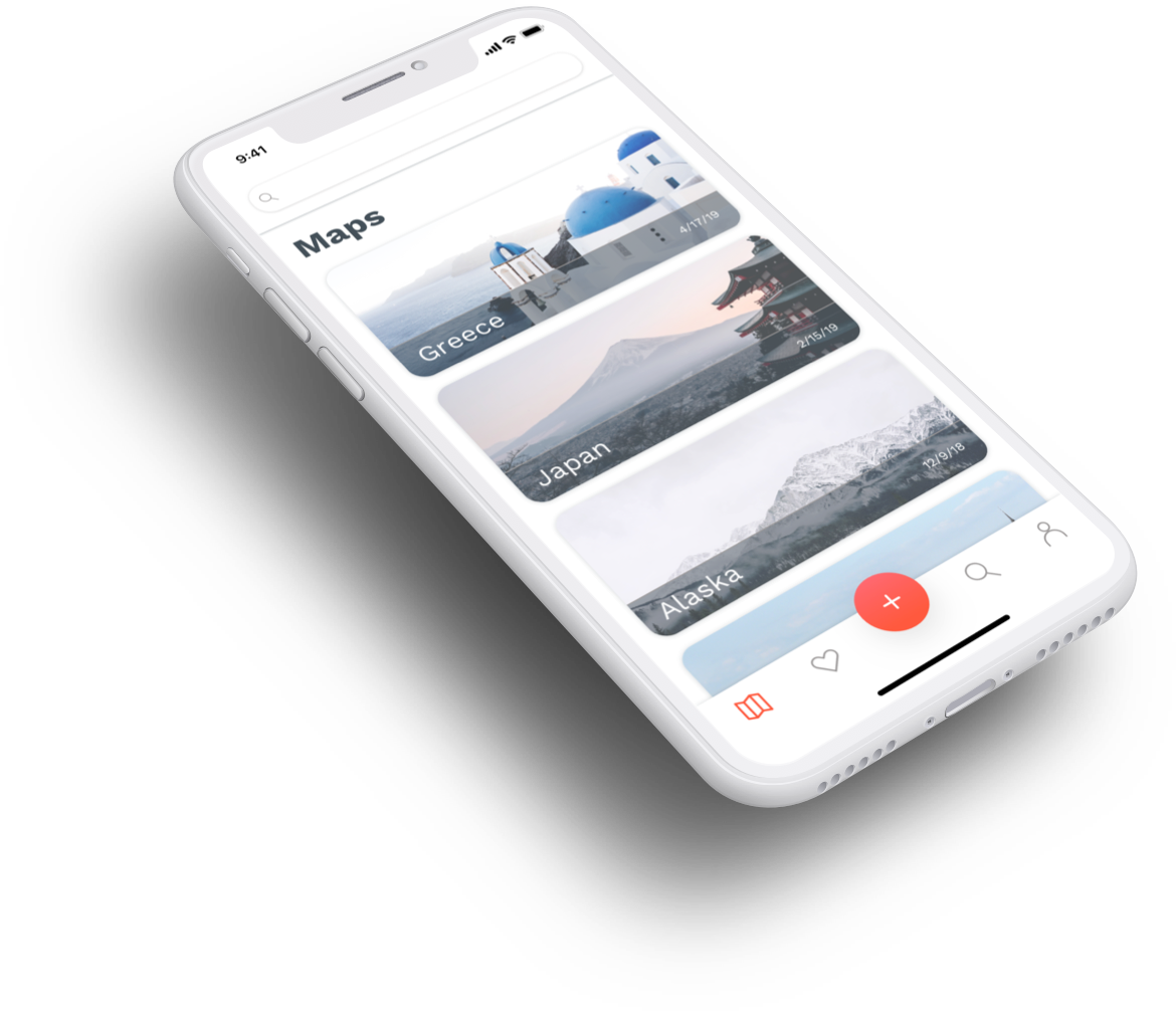
Hitmap is a friend-sourced travel platform that provides a standard, easy, and seamless way for tracking and sharing travel recommendations.
The best recommendations don’t come from strangers or critics, but from people that know and trust each other and share the same taste—friends.
The experience of exchanging travel recommendations varies from person to person. Some people share Google Docs, others send Yelp links, and some even still use paper. Hitmap eliminates the need for scattered lists in different apps and keeps all recommendations in one centralized place.
Users can curate map-based hit lists with points of interest, travel wisely knowing where things are relative to each other, and share with friends to help them plan their trips as well as inspire them to explore the world.
UX designer
Product designer
Visual designer
Sketch
InVision
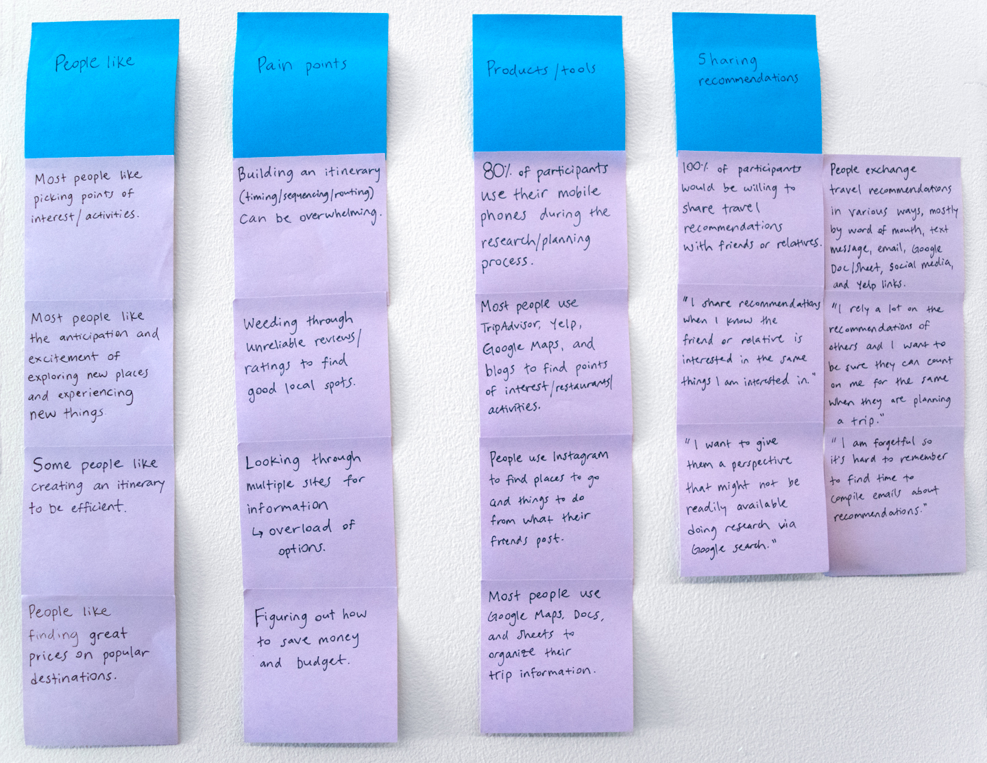
I started by surveying people who travel to better understand their needs, motivations, behaviors, and pain points during the trip planning process.
I sent out a Google Form containing a mix of closed- and open-ended questions. Although I didn’t receive enough responses to be statistically significant, I received 22 responses in a short amount of time—one day— which gave me valuable qualitative data.
This survey also allowed me to recruit and screen participants for follow-up interviews where I learned more about their pain points and needs.
I created an affinity diagram to narrow down and organize the research findings, identify key themes, and create insight statements. Afterwards I developed “How might we” questions to define opportunities for design.
I analyzed the top competitors to identify opportunities for Hitmap. Combining the advantages of Google Maps and Google Docs/Sheets seemed like a step in the right direction.

To further synthesize all the research findings and inform all design decisions I created personas based on two types of travelers: detail-oriented planners and loose planners.


I used the MoSCoW method to define and prioritize the features for Hitmap.
With all the research insights and personas in mind, I mapped out the experience of planning a trip to discover opportunities for resolving frustrations and imagining interactions with Hitmap.

I designed the app’s content to match users’ needs and expectations ensuring easy navigation and usability.

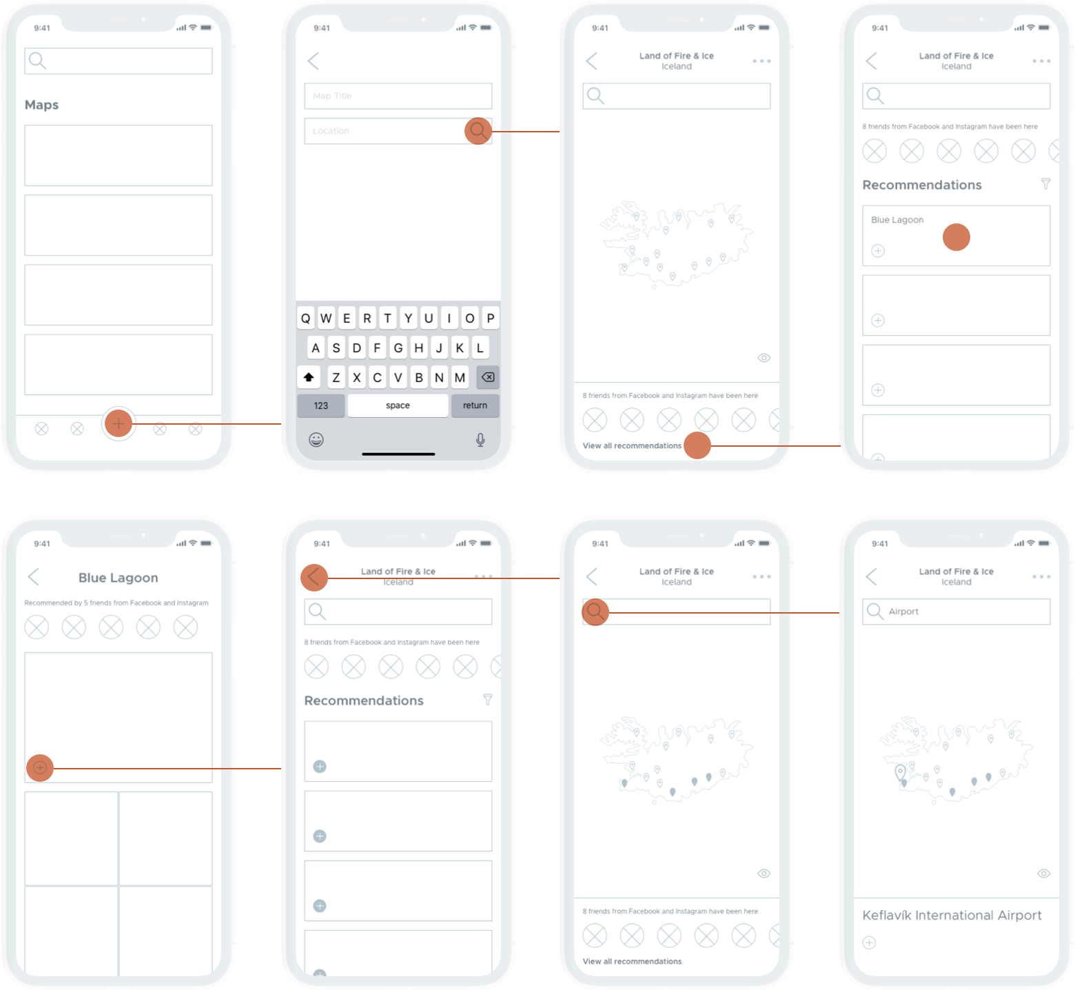
I created wireframes for the main flow of the minimum viable product (MVP).
Upon opening the app, the user would see a list of all maps. To add a new map the user would tap on the plus button, name it, and search for the location. A map of the location would appear along with recommendations already created by friends synced from social networks. The user can then browse through all the recommendations, view notes and photos, and add them to the map. The user can also search and add any place to the map.
I designed Hitmap to be clean and minimalist. The palette is energetic and earthy; typography is both functional and modern; and navigation in the bottom tab bar is clear and intuitive.
App icon

Colors
Typography

Tab Bar


After a self-care check-in, users complete their programmed workout with the help of a weight plate calculator. Users can also record form check videos and take notes.

Users can dive deep into their training log and form check videos, share them with their coaches to analyze form and technique, and work on how to improve and get stronger.

Users can easily view their individualized program designed by their Barbellona coaches. Programs are updated every cycle and continuously adjusted based on progress.

Users can access a forum where they can connect, help, and inspire each other. Discussions vary from training to mental health. Conversations with coaches and other lifters is key.

Users can create their own affirmations to promote positive thinking, journal to improve mental health conditions, and set reminders to practice self-care.