Interviews
Field research
Affinity diagramming
Insights
Ideation
Storyboarding
Prototyping
User testing
Usability testing
Design iterations
Visual design
As a San Diego City College student I experienced the challenges of getting affordable, healthy lunch in Downtown in between long classes. The cafeteria on campus has been closed for renovation for more than three years. Nearby food options are limited, unhealthy, and overpriced.
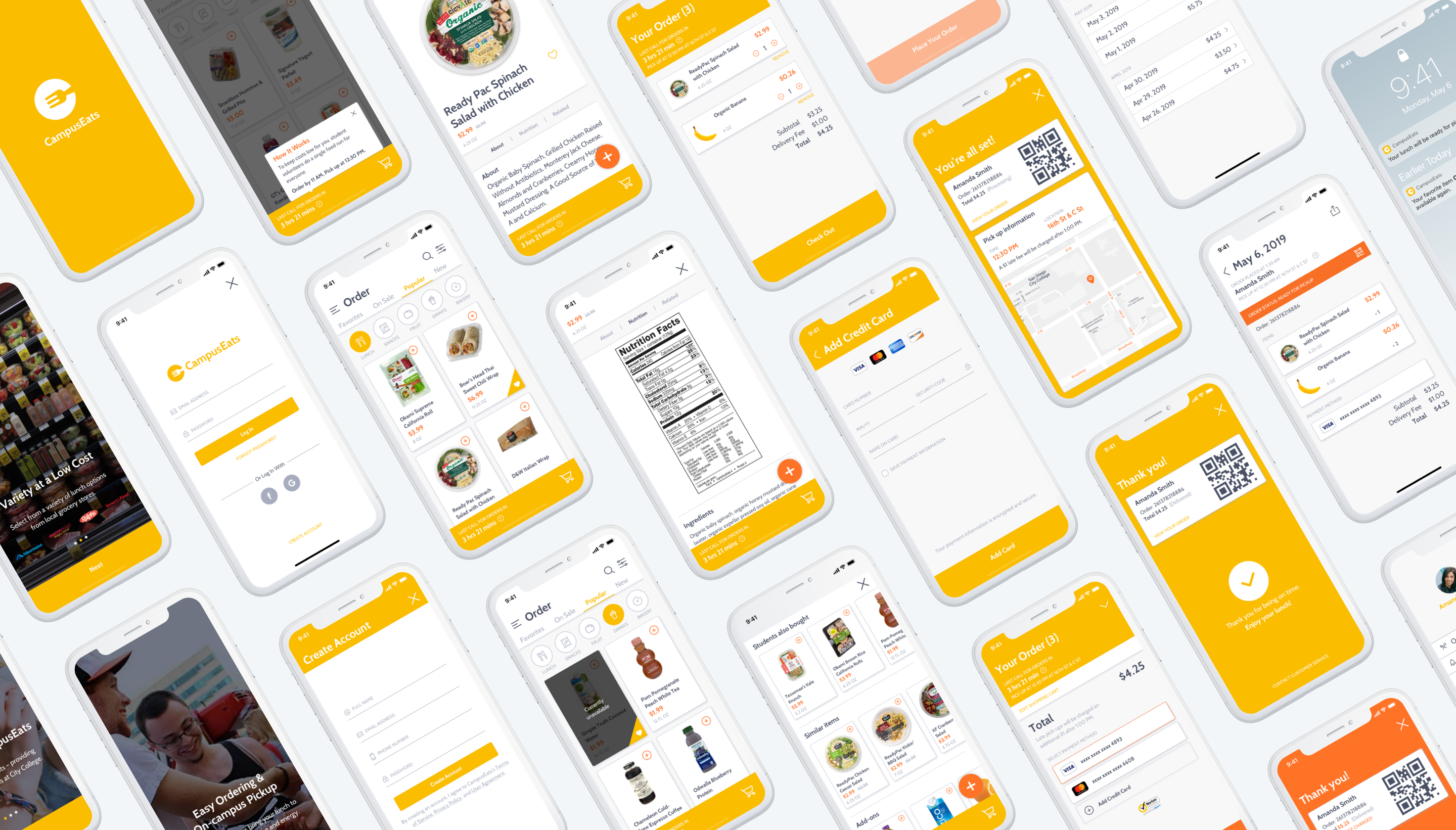
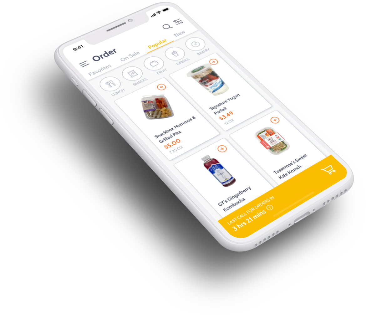
Using IDEO’s human-centered design process my teammate and I designed CampusEats, a food delivery app that partners with local grocery stores to provide healthier food options at a low cost for students.
UX researcher
Product designer
Visual designer
Sketch
Marvel
InVision
Carol Taira
Betty Lau
We began by conducting thorough research to create the foundation for our design solution. We crafted an interview guide to learn about personal details, needs, motivations, frustrations, and interactions from different types of people, places, and situations.
City College students who get lunch on campus or nearby
Nutritionist from Family Health Centers of San Diego
Emergency Food Pantry
Mesa Commons cafeteria at Mesa College
Students getting lunch
Massdrop: community-driven commerce platform
Gustin: crowdsourced fashion
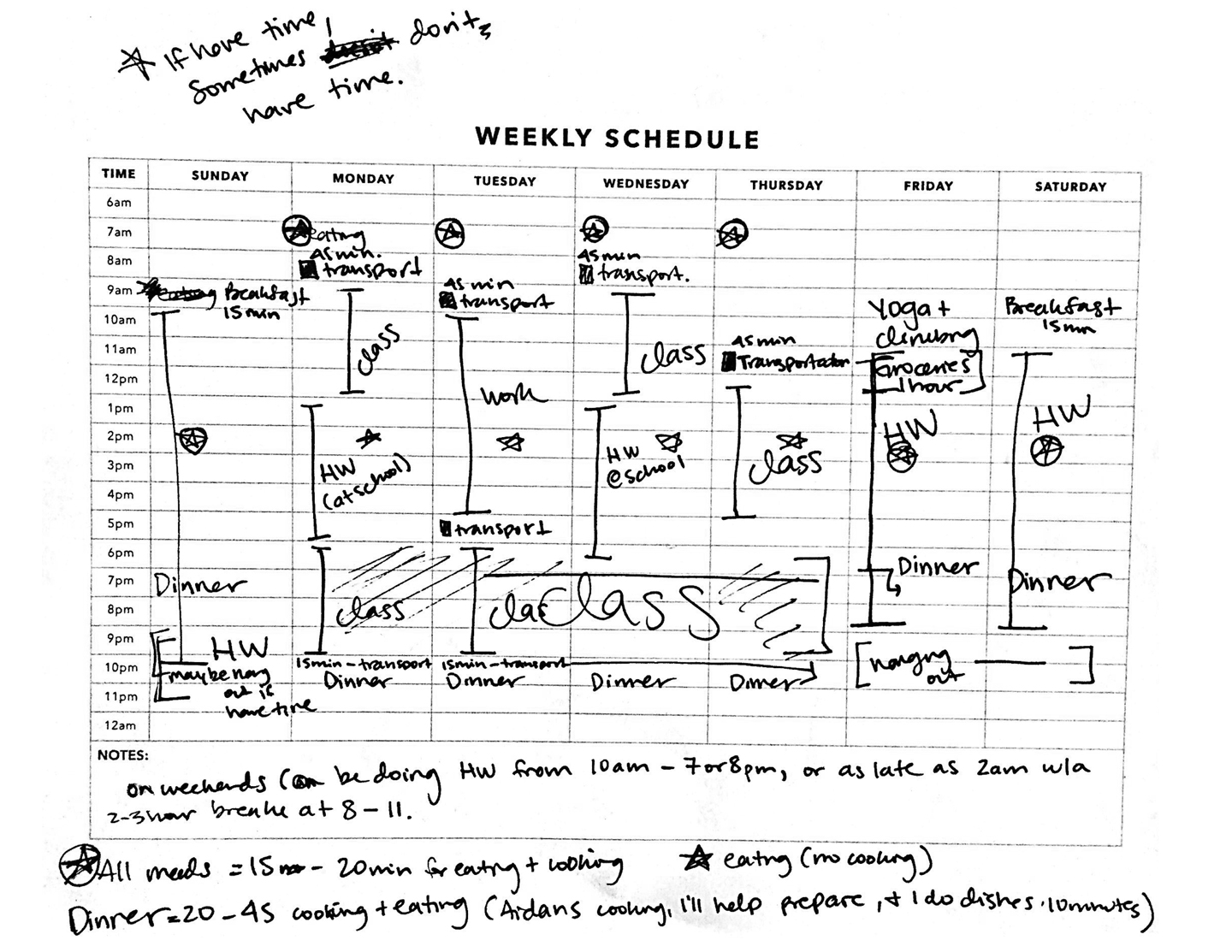
Many students, like this one, have busy schedules with very little time to cook and eat.
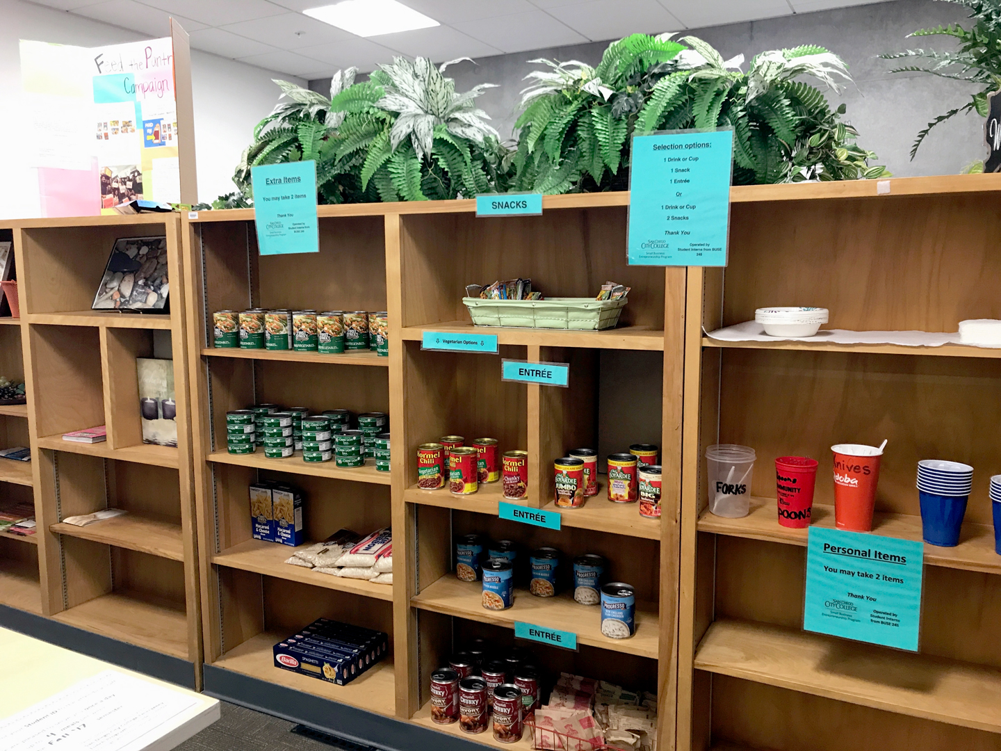
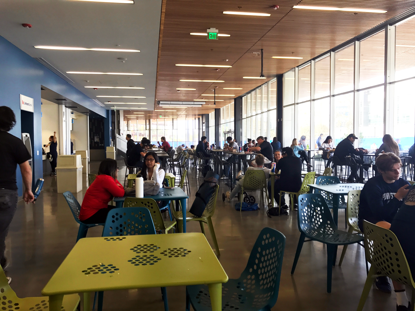
We visited the Emergency Food Pantry at City College to learn how they help students in need in addition to Mesa Commons to observe how students’ needs were met.
We used affinity diagramming to organize our findings from the interviews, identify key themes, and create insight statements. Then we developed “How might we” questions to define opportunities for design that were differentiated and generative.
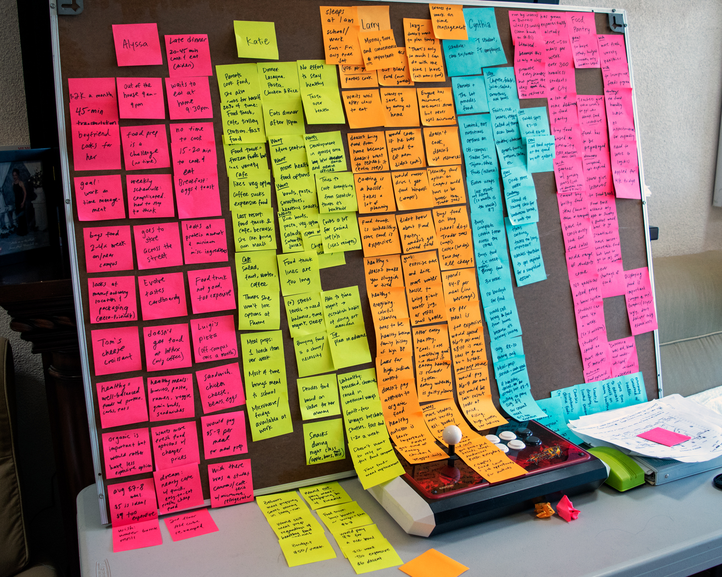
During our brainstorming session we generated as many ideas as possible related to our three “How might we” questions and narrowed them down to what we thought was the most innovative and likely to succeed.
At first we were thinking along the lines of GrubHub but with mass ordering to receive a discount from restaurant partners and pass on the savings to students; however, delivery fees and tipping would still be a deterrent. So I came up with the idea to pivot to grocery stores instead since a variety of healthy food options is readily available that is a lot more affordable than restaurant entrees.
And thus CampusEats was born: a food delivery app that lets students order lunch from nearby grocery stores such as Albertsons, Grocery Outlet, Ralphs, and Smart & Final.
These grocery stores have click-and-collect in-store pickup programs so the infrastructure already exists and would seamlessly integrate with our service. Unlike Uber Eats and Postmates, CampusEats doesn’t charge exorbitant delivery fees because a student volunteer does a single mass pickup and delivery straight to a designated spot on campus, saving students time and money.
Students order lunch by 11:00 am.
A student volunteer picks up all lunch orders from the nearby grocery stores.
Students get their lunches on campus at 12:30 pm.
We created a storyboard to visualize the end-to-end experience a user would have with CampusEats.
The user

Amanda is a 23-year-old student who buys food on campus almost every day.
Awareness

She gets handed a flyer on the way to her morning class that promotes the CampusEats app.
Initial purchase
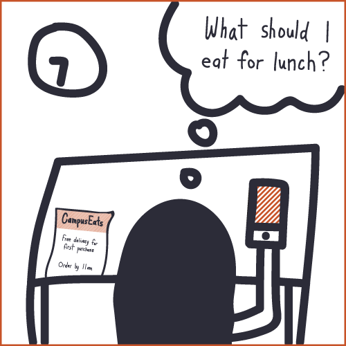
It’s 9:35 am. She’s sitting in class already hungry. She downloads the app and places her order.
Transaction complete
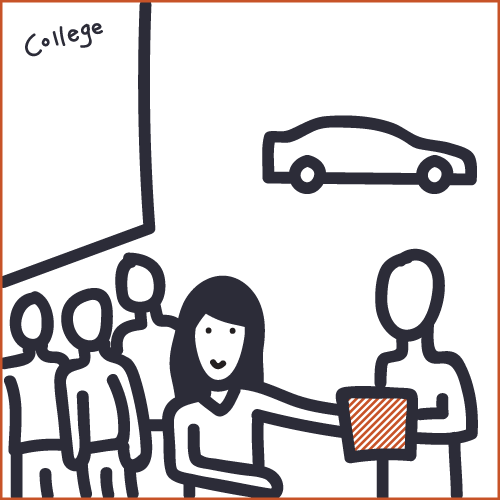
At 12:30 pm the delivery person arrives on campus with all the orders. Amanda gets her lunch.
Delight

She sits down and eats her sandwich during the break in between her classes.
Retention

She happily browses through the CampusEats app and places her order for tomorrow.
We rapidly tested a low-fidelity paper prototype with users to validate the initial concept of the app and gather feedback early in the process.
Then we prepared usability test scripts and conducted four series of usability tests with eight students, which helped us identity pain points and moments of delight, improving each design iteration.


We designed CampusEats to be intuitive, light, and airy. The logo is conceptually striking; the color palette is appetizing and fresh; typography is both humanist and modern; and food photography is clean and vibrant.
App icon
Colors
Typography

Photography

